Watercolor’s most important color
I believe that the single most important thing to paint great watercolors is described here. Let me know if you agree -or not- by leaving a comment.

What makes watercolor unique?
Â
Three things make watercolor unique to me as a painting medium:
- The exclusive use of transparent pigments
- White paper that reflects lights back through those transparent layers
- Water used to dilute pigments, which preserves their luminosity entirely
What this means is that the absence of color is my most important tool to paint high impact watercolors.
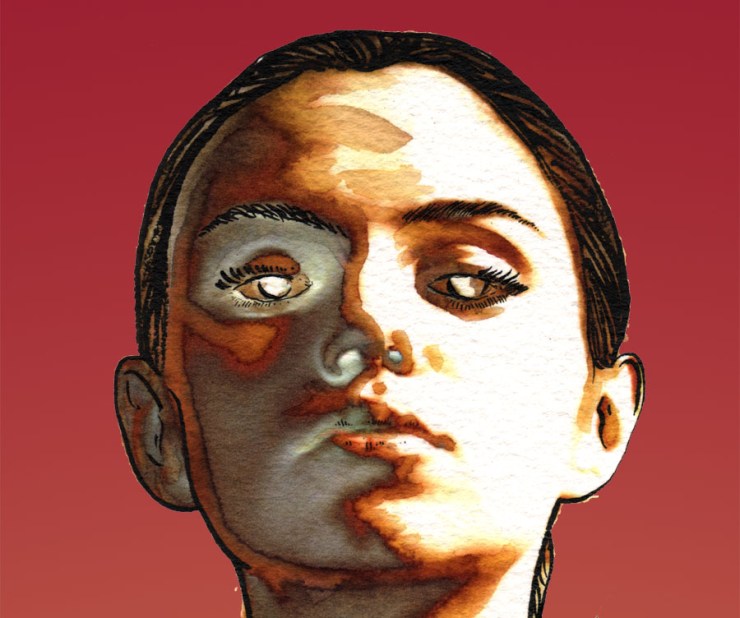
Have a look below. Nearly half of this watercolor portrait is colorless -yet it feels rich, and intense. The impact of white space is unique to watercolor, and using it well makes us better watercolorists and artists.
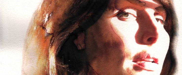
Using watercolor’s most important color
Â
As watercolorist, our most important color, therefore, is the absence of color.
How can I maximize  and leverage non-color to increase the impact of my colors?
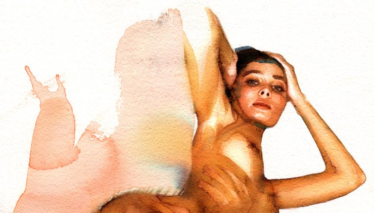
In this nude study below, I used white the three ways I know:
1. Raw, untouched paper -original white
2. Transparent washes -reflected white
3. On the model’s eyes – added white, as an opaque colorÂ
I use those three forms of white to:
- Create volumes through light to dark transitions -this is most obvious on the right elbow and arm
- Creates areas of high contrast to frame the composition band lead to the eyes of the model (the point of highest contrast -white on black)
- Balance the composition -in this case, the washes on the left balance out the bent elbow on the right
- Create both movement and contrast of movements -the washes on the left go bottom to top, following the right arm, whereas the left arm of the model has a top to bottom, light to dark gradient
- Keep an instinctive, raw aspect to the watercolor -because we want to think that watercolors are created instantly and with an absolute economy of movement and paintÂ
Let’s consider some of those uses of white.
Â

Volumes through light
Our eyes read and understand volumes by looking for light. If you help the process along, you can create volumes far more effectively than by establishing your shadows.
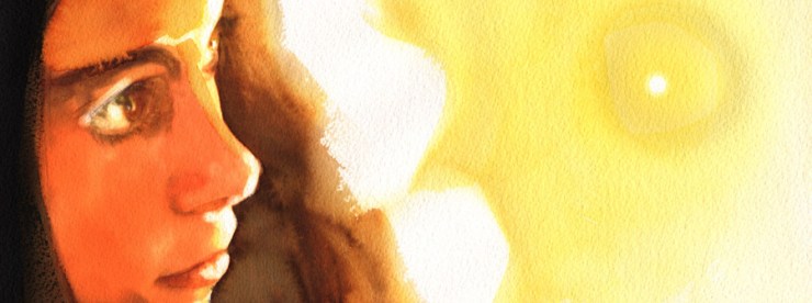
The face of the model in the portrait above has very few shadows and is given volumes by preserving the white of the paper. Our eyes disregard they lack of depth and information given to us on most of the face, and anchor themselves on the white of the paper. It always amazes how much one can get away with if light is preserved.
In very much the same way, the volume of the hair in this portrait is built entirely through the use and preservation of the white of the paper.
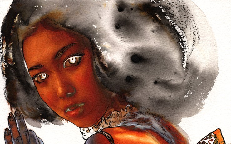
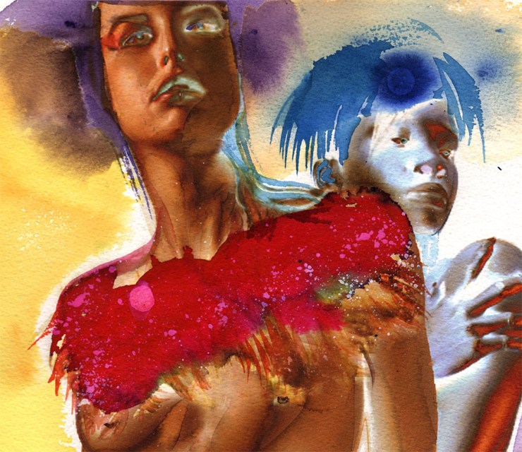
Using whites to create three dimensional effects can also be done through color negatives -using  whites where your shadows should be. In the portrait below, the model on the right is rendered in that way.

High contrast
Â
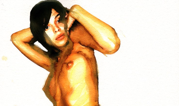
A great way to maximize the impact of your whites is to place them in direct contrast with the darkest black you can justify. I used this technique shamelessly in the portrait below… and it works.
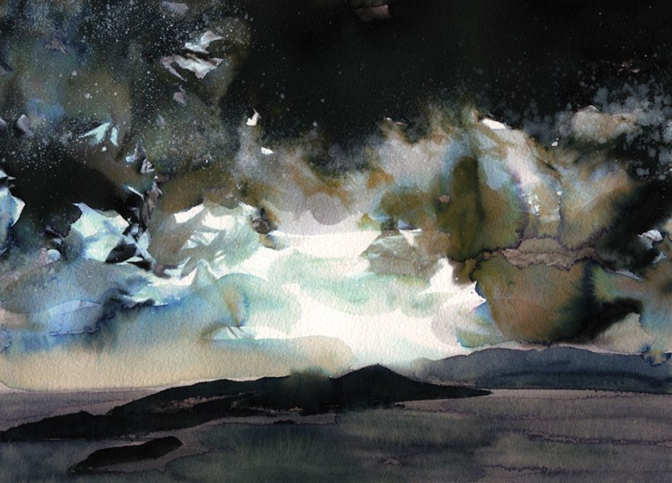
The same technique works for landscapes, as shown in this view of Port-Arthur (China):
![]()
Movement
Â
Your whites create movement because eyes like to follow light. In this portrait, the highlight on the left cheek leads you to the left eye of the model, and from there to the right eye and the focal point.
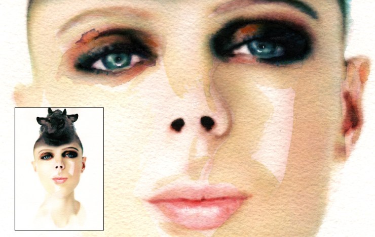
 Your whites can establish a path to the focal point. Use them to guide the viewer to your focal point.
Â
 
Instant
Finally, preserving your whites can very effectively communicate the instinctive nature of your watercolor and the flow of your brush. In this last portrait (another color negative maximizing the uses of whites as they replace my shadows), it is the extensive presence of white paper that helps preserve the instinctive nature of the watercolor, despite the ink drawing and details that structures the face.
 Â
Â
Let me know how you use white in your watercolors by leaving a comment or a question -I look forward to learning new techniques and effects.




Hi Jean,
Thank you for your great suggestions! I’m intrigued with your beautiful and dramatic techniques. I’m planning on giving it a try… leaving more whites and even adding india ink for my darks.
Best site ever! Your examples and explanations in the various topics is clear, detailed and not sales oriented, but truly educational and energetic. Thank you so much. I will follow your site and FB posts.